Using Buffer Analyze
Buffer Analyze is our analytics dashboard for understanding how your social media content is performing across Facebook, Instagram, X/Twitter, and LinkedIn. This article covers everything Analyze offers: the dashboard tabs, custom reports, metric definitions, and the limitations to keep in mind.
⭐️ Buffer Analyze is available on our paid plans. If you're on the Free plan or looking for post-level metrics in the publishing dashboard, see Understanding sent post metrics within Buffer's Publish dashboard.
🎥 Learn more in this video walkthrough.
In this article:
- What you can do with Analyze
- Finding your way around
- Boosted post data
- Creating custom reports
- Metric descriptions by channel
- Good to knows and limitations
- FAQ
What you can do with Analyze
Analyze brings your post, channel, and audience data together in one dashboard so you can:
- Compare performance across Facebook, Instagram, X/Twitter, and LinkedIn
- See which posts, hashtags, and tags drive the most engagement
- Understand your audience demographics (Instagram and Facebook)
- Get recommendations on the best time, type, and frequency to post (Instagram Professional)
- Build custom PDF reports to share with stakeholders
- Export data as CSV or image files
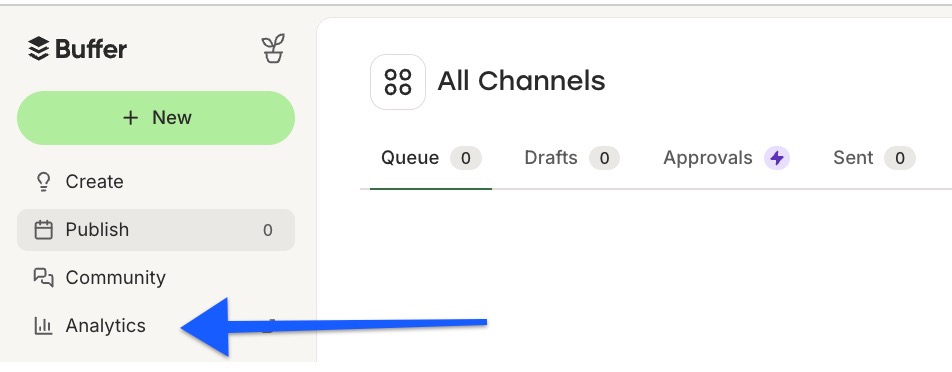
You'll find Analyze by clicking Analytics in the left side of your Buffer dashboard. It's not available on mobile.
Finding your way around
Analyze is organized into tabs you'll access from a channel's analytics view. To find any tab, select the channel from the left side, choose a profile or Page from the drop-down, then click the tab you want and set your date range.
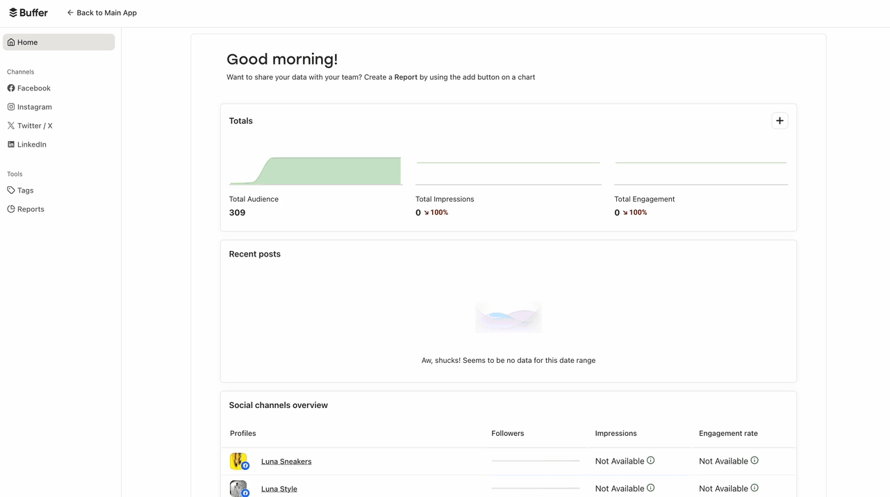
Home
The Home page shows high-level metrics across all your connected channels for the last seven days (date range can't be customized here). You'll see combined totals, your most recent posts with reach and engagement, a per-channel overview, and links to recent reports.

📝 Due to changes from Meta, reach and impressions data are no longer available for Facebook Pages.
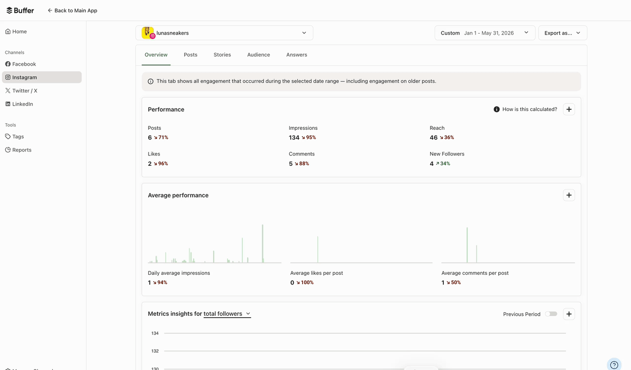
Overview
The Overview tab shows your overall engagement and follower trends for a specific channel, including:
- Performance table: Aggregate metrics for the selected date range, including engagement on older posts still receiving interaction
- Average performance chart: Average performance per post, useful for setting and tracking goals
- Metrics breakdown chart: Engagement and followers over time, with the option to compare against the previous period
Organic and boosted posts are represented by blue and green respectively. Hover over any bar to see the exact split.
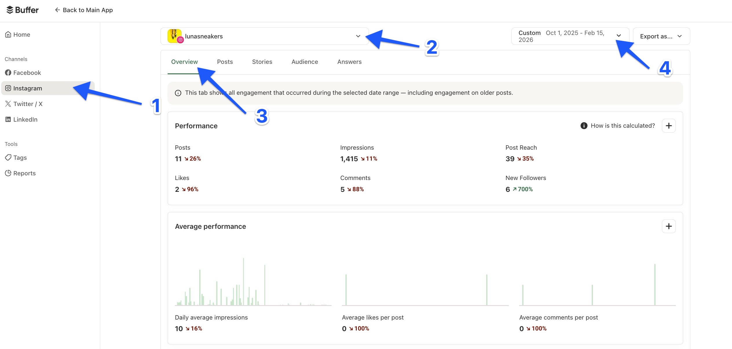
📝 The percentages shown indicate the change compared to the previous period of the same length. Stats here may differ from the Posts tab because Overview measures all engagement received during the date range, while Posts measures engagement on posts published during the selected date range.
Posts
The Posts tab gives you a history of your published posts so you can compare individual post performance and spot patterns. It includes:
- Summary table: Aggregate metrics for all posts published during the selected date range
- Hashtag performance table: Top five hashtags by engagement, including hashtags in both the caption and the first comment
- Post insights table: All published posts, sorted by impressions by default. Filter by keyword or hashtag, sort by another metric, or click any post to see all its metrics.

📝 If a post is edited or deleted after publishing, the original version will appear in your dashboard.
Audience
The Audience tab shows top demographics by gender and age, top cities, and top countries on a world map.
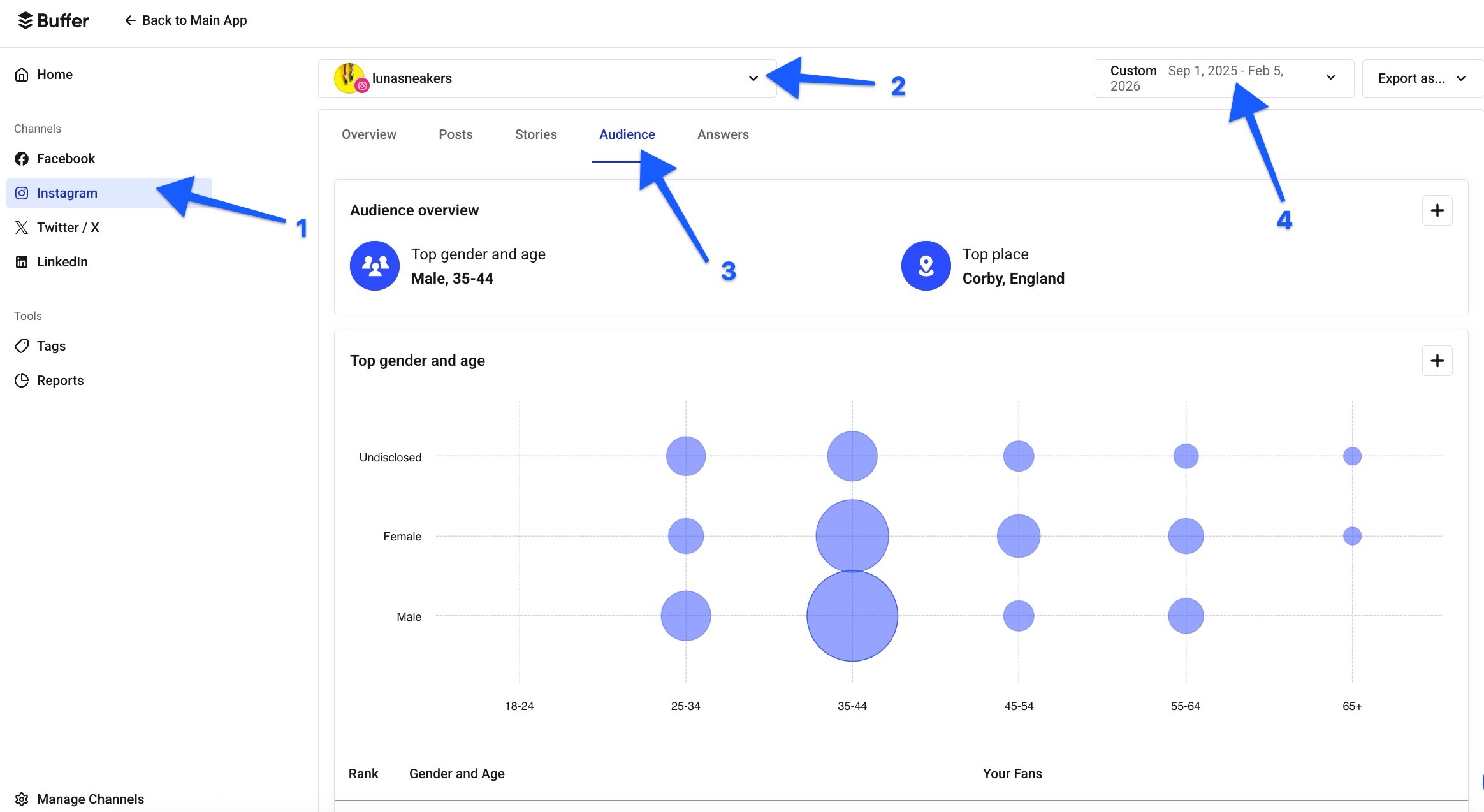
📝 Full audience data is only available for Instagram. Facebook Pages include limited location data. Audience data isn't available for X/Twitter or LinkedIn.
Stories (Instagram)
The Stories tab shows reach, completion rate, impressions, and exits for each Instagram story, plus a metrics breakdown over time.
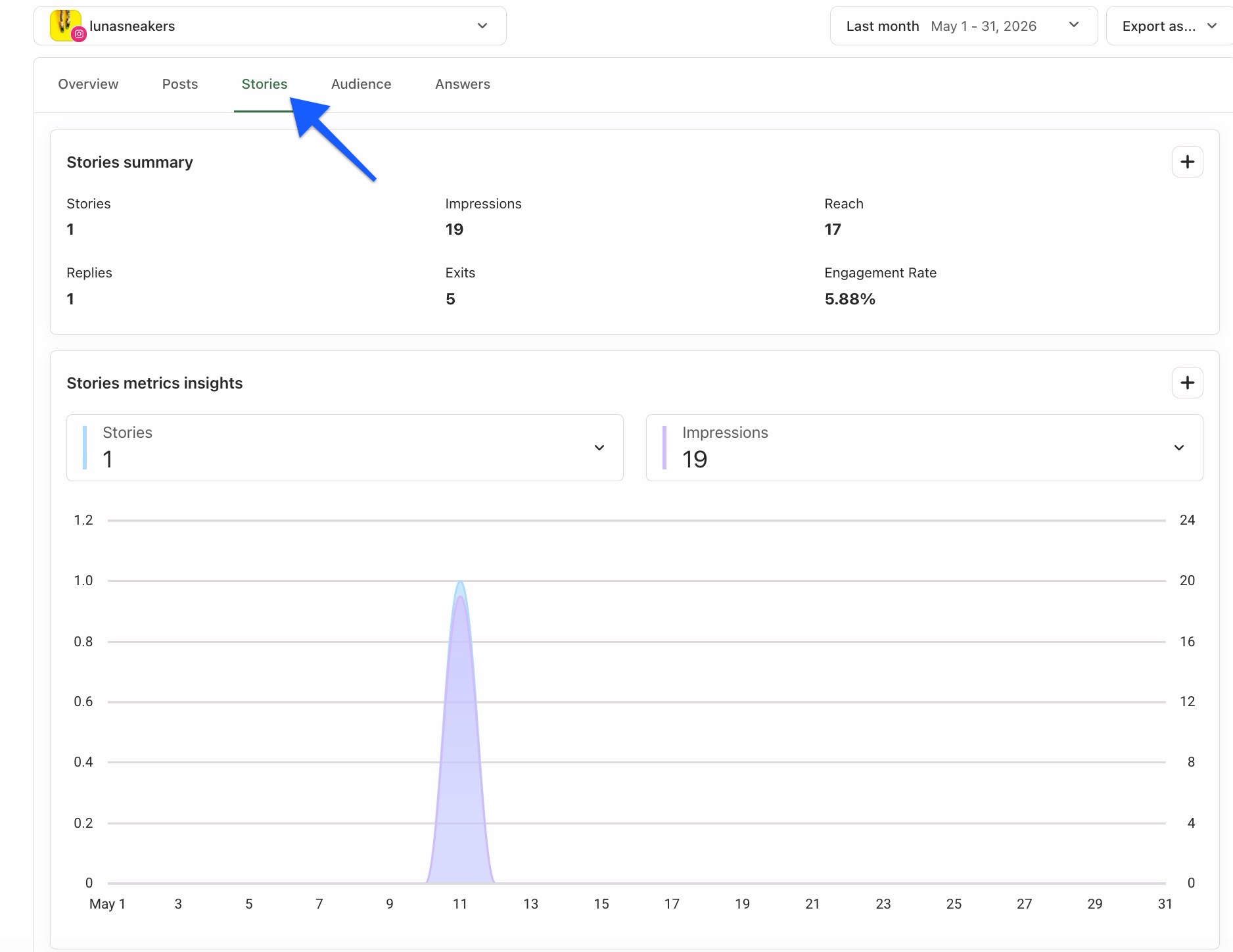
📝 A few things to know:
- Not available for Instagram Personal Accounts
- Only stories created by your account are pulled in (not stories shared after being @mentioned)
- Stories can't be backfilled and may take up to 24 hours to appear
- EEA customers will see zero story replies due to European privacy rules
Answers
The Answers tab recommends the best time, type, and frequency to post for maximum engagement.
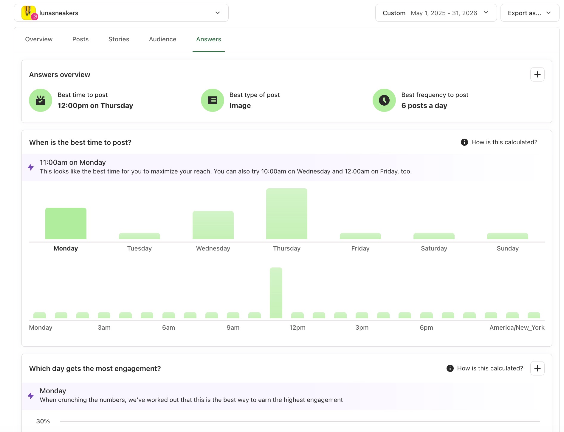
📝 For Best Time to Post recommendations to generate:
- Profile needs 100+ followers and 10+ posts in the last six months
- Only available for Instagram Professional Accounts (not Facebook, X/Twitter, LinkedIn, Pinterest, TikTok, Google Business Profiles, Mastodon, Threads, Instagram Personal Accounts, or YouTube Shorts)
- Not available for trialists
If we don't have enough data yet, we'll suggest times based on our Best Times to Post on Instagram research.
Tags
Tags let you organize content across channels and track how a campaign or content theme is performing.
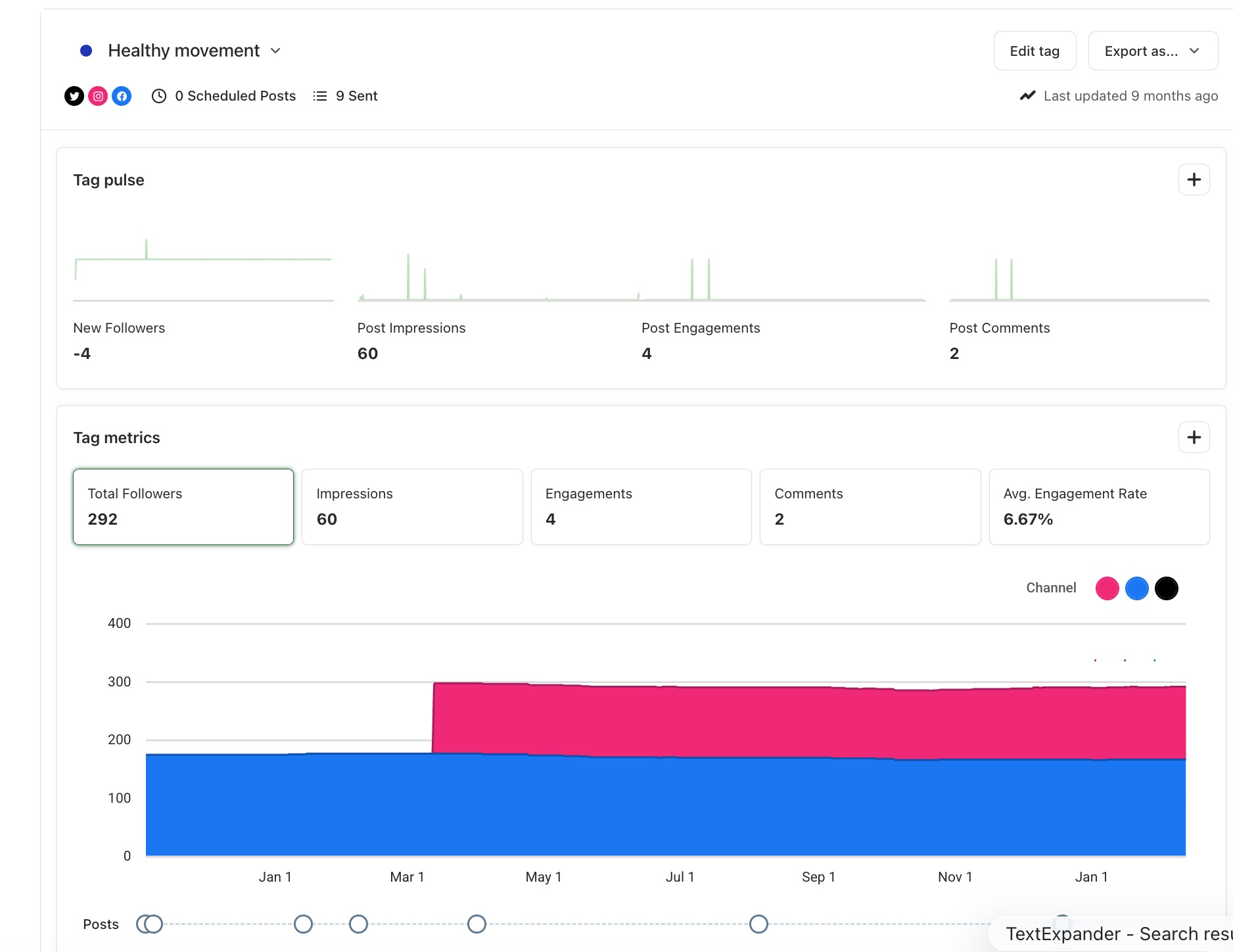
📝 A few things to know:
- The tag report shows metrics for the entire tag period (date range can't be changed)
- Tag analytics work for Facebook Pages, Instagram business accounts, X/Twitter profiles, and LinkedIn Pages. Other channels and Instagram notification posts won't appear in tag reports.
For guidance on creating and managing tags, see Creating and managing campaigns.
Boosted post data
Analyze includes data for boosted Facebook posts and promoted Instagram posts. In charts, organic posts appear in blue and boosted posts in green.
If you're not seeing boosted post data:
- Click your profile avatar in the bottom left, then choose Channels
- Click the three-dot menu icon next to the channel
- Click Refresh Connection. (For a full walkthrough, check out our guide to Refreshing a channel in Buffer).
📝 A few things to know:
- We backfill the last 90 days of boosted posts when you connect a channel. After that, data updates every six hours.
- We always exclude the current day's data
- We're not able to boost posts or run ads through Buffer
- Ads from Facebook Ads Manager and boosted X/Twitter ads aren't included
Selecting the right date range: The Post Summary table shows results of posts published and boosted during the selected range. The Post Insights table shows posts published during the range, regardless of when they were boosted.
For example, if you published a post on July 1 and boosted it August 1 to August 5: to see boosted results in the Post Summary table, your range should include August 1 to August 5. To see the boosted post in the Post Insights table, your range should include July 1.
If something you'd like to see isn't supported, let us know on our suggestions board.
Creating custom reports
You can build custom PDF reports using any of the tables and charts in Analyze. There's no need to create a new report each week or month, since you can change the date range any time you view it.
📝 Custom reports are available for account owners and users with Admin access only. Learn more about adding users and setting up permissions.
Adding tables and charts: From any tab, click the plus (➕) button at the top right of any chart. To create a new report, enter a name and click Create Report. To add to an existing report, click the report name.
📝 After clicking Create Report, you won't be taken to the report. The window will close, so you can add more charts to your report/s.
Viewing and customizing reports: Click Reports on the left side of your dashboard. From here, you can:
- Change the date range
- Rename, add a description, or upload a logo (PNG and JPG)
- Reorder elements with the up and down arrows when hovering
- Remove a chart by hovering and clicking the X icon
- Add notes to charts with Add chart note
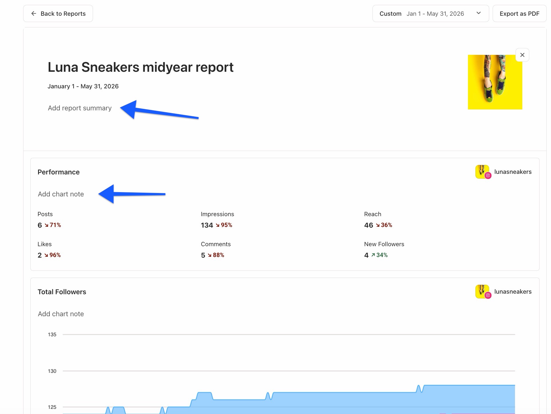
📝 Custom reports are in the UTC timezone.
Downloading reports: Click Export as PDF at the top right. Here's an example report. For a quick image or CSV export, click Export as... in the upper right of any tab.
Metric descriptions by channel
All Facebook metrics are pulled from Facebook's Graph API.
| Metric | Description |
|---|---|
| Posts | The number of posts sent. |
| Page & Post Engagements | Total engagements (likes, comments, shares, and more). |
| Engagement Rate | The percentage of impressions that resulted in an engagement. Organic data only. |
| Reactions | The number of reactions your posts received. |
| Shares | The number of times your posts were shared. |
| Comments | The number of comments on your posts. |
| Post Clicks | The number of clicks your posts received, including clicks on the post, links, images, videos, and multiple clicks by one user. |
| New Fans | The number of fans you gained or lost. Fans are people who have "liked" your page (not followers). |
| Total Fans | Your total number of fans. |
📝 Due to updates from Meta, we're no longer able to ingest post clicks, organic impressions, engaged users, or gender/age demographics for Facebook Pages. Paid data isn't impacted (paid impressions, paid reach, and paid link clicks are still available).
All Instagram metrics are pulled from Instagram's Graph API. To view advanced analytics, your account must be set up as a professional account and connected to a Facebook Page.
| Metric | Description |
|---|---|
| Posts | The number of posts sent. |
| Stories | The number of stories shared. |
| Reach | The number of unique people who saw your posts or stories. |
| Impressions | The number of times people saw your posts or stories. Always higher than Reach. |
| Engagement | The number of likes, comments, and post saves. |
| Engagement Rate | The percentage of impressions that resulted in an engagement. Organic data only. |
| Likes | The number of likes your posts received. |
| Comments | The number of comments on your posts. |
| Post Saves | The number of times your posts were saved. View under Posts > Post Insights by clicking the post image. Doesn't show in reports. |
| Replies | The number of replies to your stories. See the EEA note below. |
| Exits | The number of exits on your stories (swiping away, swiping down to feed, or closing Instagram). |
| Completion Rate | The number of people who view your entire story, calculated as 1 - (exits / impressions). |
| New Followers | The number of followers you gained or lost. |
| Total Followers | Your total number of followers. |
📝 For Instagram Reels, we can only pull in impressions, likes, and comments due to API limitations.
X/Twitter
All X/Twitter metrics are pulled from Gnip (X/Twitter's enterprise data service) and X/Twitter API v2.
| Metric | Description |
|---|---|
| Posts/Tweets | The number of posts sent, not including reposts or replies. |
| Impressions | The number of times people saw your posts in their timeline or search results. |
| Engagements | The number of times users interacted with your posts. Calculated as a sum of likes, replies, reposts, quotes, link clicks, and profile clicks. App opens, app install attempts, and hashtag clicks aren't included. |
| Engagement Rate | The percentage of impressions that resulted in an engagement. |
| Likes | The number of likes your posts received. |
| Reposts/Retweets | The number of times your posts were reposted. |
| Replies | The number of replies on your posts. |
| Clicks | The number of clicks your links received. |
| New Followers | The number of followers you gained or lost. |
| Total Followers | Your total number of followers. |
📝 X/Twitter sent post analytics are only available on our current plans, not legacy plans.
| Metric | Description |
|---|---|
| Posts | The number of posts sent. |
| Impressions | The number of times people saw your posts. |
| Clicks | The number of clicks your posts received (content, company name, or logo by a signed-in member). Doesn't include shares, reactions, or comments. |
| Likes | The number of likes your posts received. Can be negative if more people remove likes than add them. |
| Comments | The number of comments on your posts. Can be negative if more people remove comments than add them. |
| Shares | The number of times your posts were shared. |
| Engagements | The number of organic clicks, likes, comments, and shares. |
| Engagement Rate | The percentage of impressions that resulted in an engagement. Can be negative if likes or comments are negative. |
| Page views | The number of views received by your LinkedIn Page. |
| New Followers | The number of followers you gained or lost. |
| Total Followers | Your total number of followers. |
Good to knows and limitations
Data backfill when you first connect a channel
| Channel | Post data backfill | Channel data backfill |
|---|---|---|
| 50 posts (no stories) | 6 months (some demographic exclusions) | |
| 30 days (no stories) | 6 months | |
| 50 posts (no video posts) | 6 months | |
| X/Twitter | Up to 100 posts from the last 30 days | Not available |
📝 Data isn't collected in real time. It's pulled in daily batches and can take up to 24 hours to appear.
✨ Free plan users who start a paid trial will see posts that they published while on the Free plan backfill in the dashboard during their trial.
- Due to Meta limitations, we can't ingest post clicks, impressions, engaged users, or gender/age demographics for Facebook Pages
- Facebook accounts need 100+ fans for data to be available
- After a calendar month, metrics for individual posts stop updating
- Facebook Reels and Facebook Stories data aren't pulled into Analyze (Reels metrics are available in the Sent tab of Publish)
- Ads created through Facebook Ads Manager aren't included
- Instagram business accounts need 100+ followers for data to be available
- Analytics will only backfill if the Instagram account is linked to a Facebook Page
- Stories, audience data, and follower counts can't be backfilled
- For Reels, only impressions, likes, and comments are available
- IGTV and collaboration post data isn't available
- After a calendar month, metrics for individual posts stop updating
X/Twitter
- 30 days of data is backfilled when you connect your account
- Natively published posts can take up to 24 hours to appear. Posts published by Buffer appear immediately.
- We can ingest data for 100 posts per day across natively published and Buffer-published posts. If you publish more than 100 in a day, some native posts may be missed.
- Follower counts can't be backfilled
- After 20 days, metrics for individual posts stop updating
- The post count doesn't include replies or reposts, so it may differ from X/Twitter Analytics
- For threads, only data for the first post is pulled in
- Engagement totals may be lower than X/Twitter Analytics due to how we calculate engagement (see metric table above)
- Boosted X/Twitter ads aren't included
- Analyze supports LinkedIn Pages but not LinkedIn profiles. For profile metrics, visit the Sent tab of Publish.
- We fetch metrics for the last 500 posts
- Carousel posts created with PDF files aren't supported (multiple image posts are)
- We can pull in metrics for LinkedIn sponsored posts
- We can't pull in metrics for reposts
Disconnected channels
If a channel disconnects, your latest data won't populate. See Refreshing a channel in Buffer to reconnect.
FAQ
I just connected my account but I can't see analytics. Why?
Data isn't collected in real time. We pull from each network's API in daily batches, and it can take up to 24 hours for new data to appear. Check back in a day or two.
Why does my data in Analyze differ from native analytics?
A few reasons: we backfill limited amounts of data when you first connect a channel, API limitations restrict certain metrics, and the way we calculate things like X/Twitter engagement differs from how each network does. See the Good to knows and limitations section for specifics.
Can I compare my data year over year?
Not automatically. Once you've used Buffer for over a year, you can select the current year as the date range and create custom reports to compare against the previous year's data.
Is it possible to export sent posts?
Yes. From any tab, click Export as... to download CSV or image files. For a polished PDF, build a custom report and click Export as PDF.
Can I see analytics in the mobile app?
Not at this time. Analyze is only available on the web dashboard.
More resources
- Understanding sent post metrics within Buffer's Publish dashboard
- Understanding UTM parameters and Google Analytics
- Social Media Metrics You Should Be Tracking (And Why)
- The Best Time to Post on Social Media, Backed by Data
📝 Need help with Analyze? Send us an email at hello@buffer.com and our Advocacy team will be standing by to assist!